Whilst a squeeze page might sound pretty uncomfortable… they can be incredibly effective to grow your leads and sales.
In this article we’re going to explore:
✔️What a squeeze page actually is
✔️Why you might use one
✔️The difference between Squeeze Pages, Landing Page & Websites
✔️Real-life examples of squeeze pages
✔️How you can build you own squeeze page without a designer
✔️The lead-generating squeeze page checklist
So let’s dive in! First things first…
What on earth IS a squeeze page?

In a nutshell, a squeeze page is simply a page that is designed specifically to turn a visitor into a lead.
You’ll find no fancy about pages or blogs here; just a highly intentional page with one laser-focused objective…
Getting your prospects contact information and turning them into a lead.
( At their own will of course! Bribery is NOT the way to go! 😆)
Typically a squeeze page will offer something of genuine value upfront in exchange for your prospects email address, usually called a lead magnet.
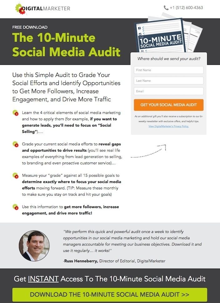
Here’s an example from our partners over at Digital Marketer with their 10 minute social media audit document being used as a lead magnet:
It’s also worth noting that a squeeze page is often only the entry-point of a larger sales-funnel.
The squeeze page will often lead to a thank-you page which then may include an upsell offer or sales page as seen in the funnel below:

So why use a squeeze page over anything else?
The main reason for using a squeeze page is when you’re looking to generate as many leads as possible.
This may be to create more top of the funnel leads or just to build up a healthy pipeline of prospects overall.
However, a squeeze page should not be seen a replacement for a good quality website.
Instead, it serves more as a bolt-on, or tool to generate leads.
Squeeze Pages Vs Landing Pages Vs Websites
By now you’re probably getting a sense for what a squeeze page is and what it’s used for.
But you may have also heard people talking about landing pages. If so, you’re probably wondering what the difference is between a landing page and a website.
Or the difference between a squeeze page and a landing page…
Well let’s break these down individually.
Websites
The best way to think about your website is that it’s almost like your central hub of operations. It’s a place customers can come to learn more about your business and possibly read a blog or engage further.
Landing Pages
Whilst your website will typically have different pages visitors can explore; A landing page is actually more similar to a squeeze page in the sense it has one primary call-to-action. In a nutshell though, a landing page is just a specific page that your customers “land” on when coming from an external source like a paid advert.
For that reason squeeze pages and landing pages are typically what you’d use for something like a PPC campaign. However, landing pages come in a variety of shapes and sizes and don’t always need to have an email opt-in form.
Squeeze Pages
A squeeze page on the other hand has the primary goal of converting that visitor to a lead. For this reason, they’re typically short in length, straight-to-the-point and always contain some form of opt-in box.
Real life examples of squeeze pages
Whilst a squeeze page is all about converting visitors to leads, the method of doing that can vary.
Some squeeze pages may have a short video to explain why people should opt-in, whereas others may be text only.
Let’s take a look at some examples below:
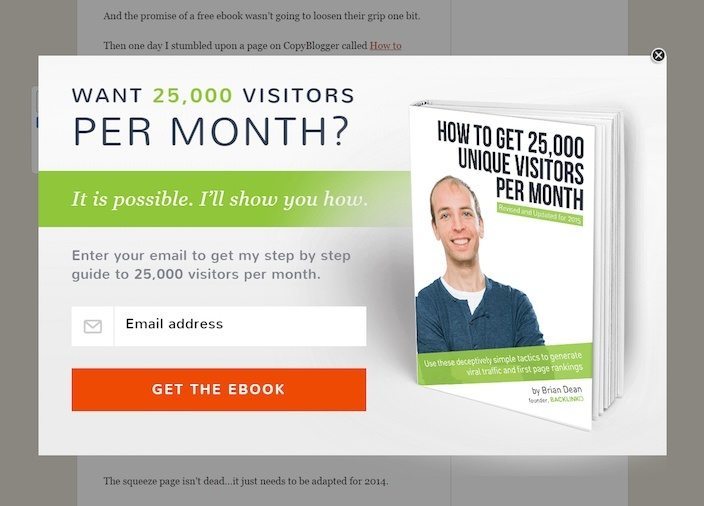
Here’s an example of a squeeze-page/popup from Brian Dean of Backlinko. You’ll notice, it’s extremely short and instead of delivering tonnes of information. It simply makes one-big promise and offer a lead magnet in exchange for visitors contact information.
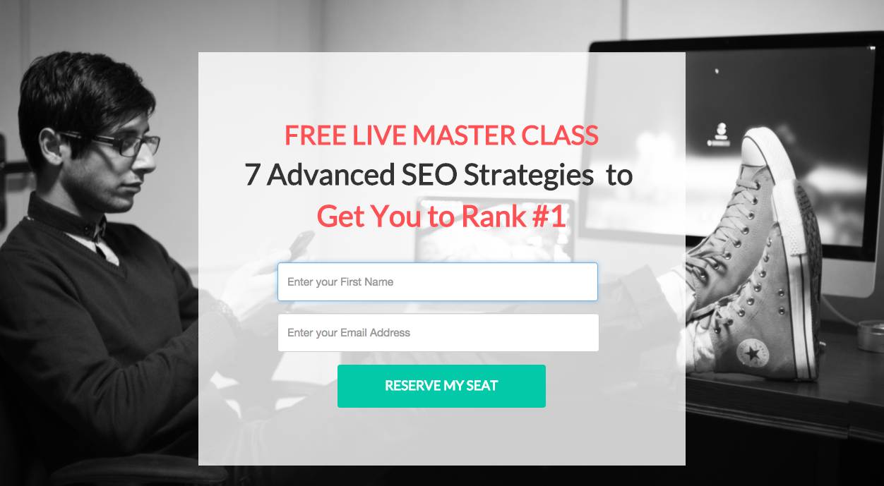
Here’s one offering admission to a free masterclass. Again, minimal details on the page, but ultimately makes one-big promise in exchange for a name and email address.
Here’s an example of a squeeze page that doesn’t offer a lead magnet as such. But is instead offering the visitor to simply sign up to a mailing list. This can be effective for bloggers or influencers who already have a following on other channels and are looking to get more email subscribers:

How can you build your own squeeze pages?
There are a number of great tools out there which will allow you to build your own squeeze pages and sales funnels.
The most well-known of which is probably click-funnels.
The great thing about these tools is they allow you to create entire sales funnels.
This means you can literally map out everything form the squeeze page itself, to the thank you page or sales pages. A lot of them will also integrate with payment gateways such as Stripe or PayPal to allow you to take quick and easy payments in your funnel.
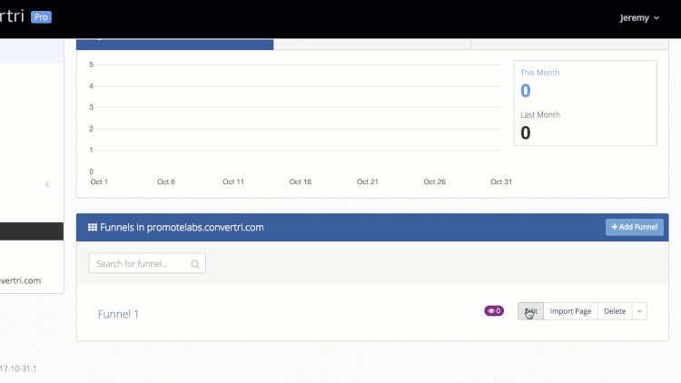
Our personal recommendation and the tool we use ourselves is Convertri.
It’s extremely easy to make great looking page and funnels with it’s drag & drop builder and funnel maps:
But it’s also much cheaper than its competitor Clickfunnels with packages starting at just $53 a month!
Convertri also uses a form of APT (Accelerated Page Technology) meaning the pages load blisteringly fast.
This is becoming increasingly important since Google has started cracking down on slow-loading pages and websites.
If you’re considering building your own funnels and squeeze pages, you can get a 14-day free trial with Convertri here.
The lead-generating squeeze page checklist
Before you rush off and start building your own squeeze pages.
Our friends at Digital Marketer have put together this handy list to help you optimise your page. These are some of the same principles that have helped built 100’s of multi-million dollar sales funnels so pay close attention:
✅Does your landing page callout your audience?
Consider who your squeeze page is targeting. For example, if you own a pet-grooming shop and your customer avatar is dog owners; you might start by saying “Calling All Dog Lovers”.
✅Is there any social proof?
If possible, use “as seen on” logos, testimonials, and/or eye-catching numbers. This can help build crediblity and trust with your visitors. Just make sure the testimonials are as relevant to the offer as possible
✅Are there too many options?
As we discussed above, your squeeze page is not your website. Too many options can overwhelm visitors and negatively effect conversions. Keep it simple and to the point!
✅Does it contain any visual cues?
Where possible, try to incorporate arrows, boxes, or other visual cues to draw attention to the CTA (call-to-action) button, ie “sign up now” or “send my free guide”.
If you’re offering a lead magnet, it’s also worth having an eye-catching mockup created to help build desire.
✅Is it simple and easy to understand?
Make sure you squeeze page delivers one single message with one single offer. It should make the “What for,” “Why,” and “What’s next” clear within the first 5 seconds.
✅Does it contain a compelling headline?
Your squeeze page must have a clear, concise, benefit-rich headline. Address how your offer will deliver a desired benefit or alleviate a pain for your audience.
✅Do your visitors have to scroll the page to sign up?
You only have a few seconds to grab someone’s attention. Make sure your visitors can see your offer and take action without scrolling.
✅Does the sign-up button stand out?
It may sound trivial but have a contrasting color on your opt-in button can significantly increase conversions!
✅Does your button text make people want to click?
Make sure your button speaks to an end result (i.e. “Free Instant Access” or ” Get Your Free Guide Now”)
✅Are there too many form fields to fill out?
Only ask people for the information you need. Typically the more fields you ask people to fill out, the less likely they are to sign up. We’d recommend sticking with just name and email address where possible.
✅Is your squeeze page congruent?
The overall look and feel of the squeeze page should match the ad that brought them there. If there is a disconnect or people feel like they’re in the wrong place, they will typically leave.
✅Do you have a visible privacy policy?
A clear and visible privacy policy is required to advertise on Google, so include links. This can also help to build trustworthiness leading to higher conversion.
✅Is your squeeze page mobile optimised?
Most page builders will include an options to edit/optimise the page for mobile. Be sure to make sure the images and text are easy to read on ALL devices as half of your visitors will likely be on a mobile device.
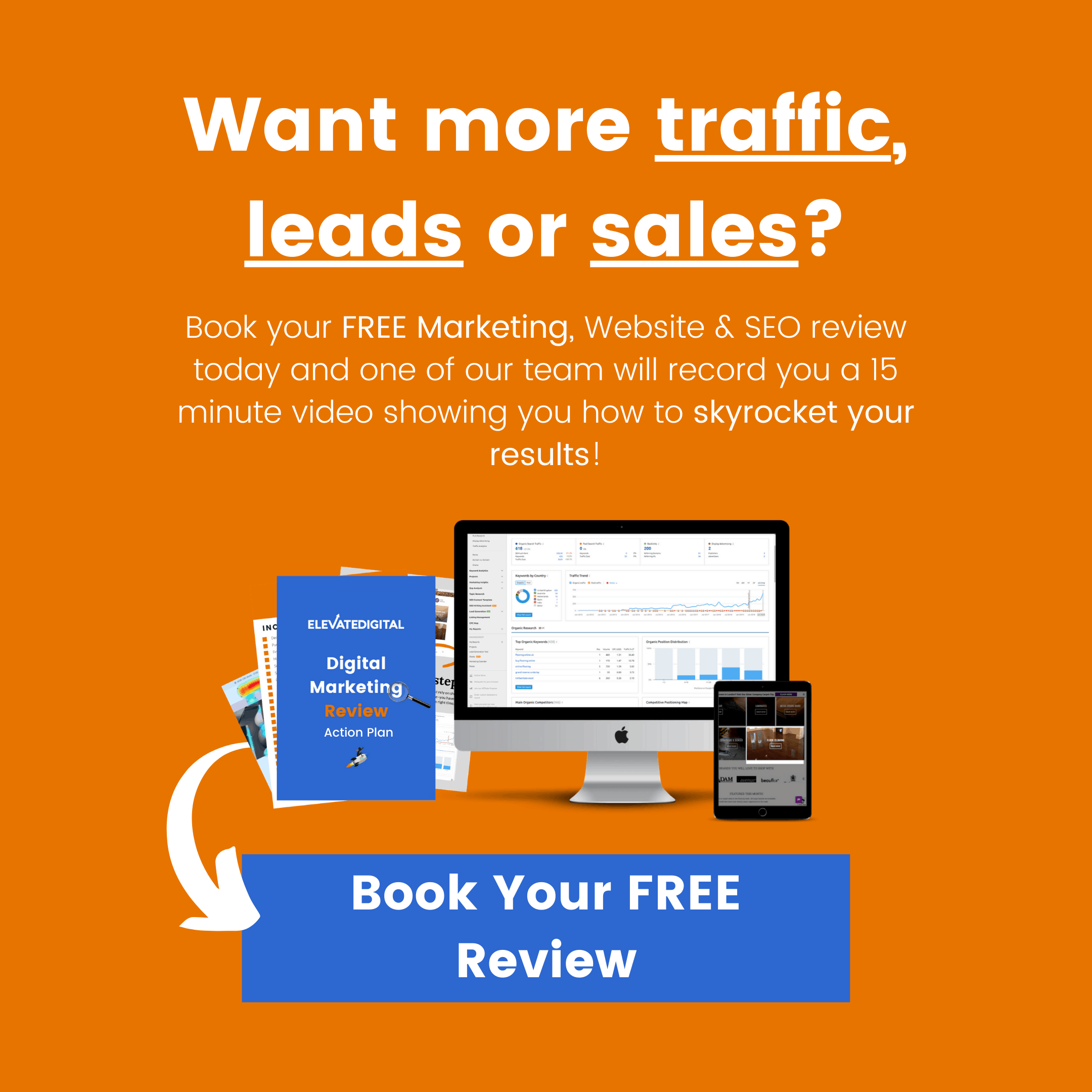
Want help building a high-converting sales funnel?
Book your FREE digital review today and we’ll go through your best options for creating a sales funnel. We’ll also record you a 10-20 minute video showing you how to increase your traffic, leads and sales.

He is a self-confessed Digital Marketing geek and is obsessed with consumer psychology and human behaviour.
In his spare time, Tom is a big advocate for meditation and self-development. He's also an avid gamer and lover of gadgets 🎮📱
- Highly-Effective DTC Marketing Strategies & Examples - February 28, 2024
- How To Set Paid Media Marketing Budget - October 16, 2023
- The Ultimate Guide To A/B Testing - September 23, 2023